<zg-layout-controls>
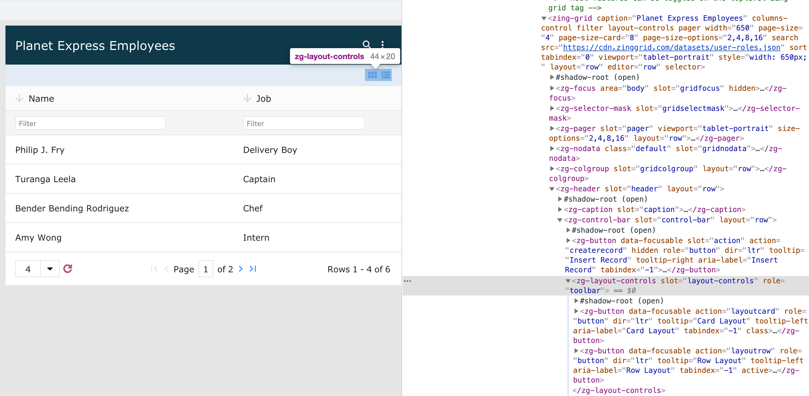
The <zg-layout-controls> tag is a container for the icons that toggle between row mode and card mode for the grid. The <zg-layout-controls> web component is created internally and should not be placed directly in the user's HTML; however, the user can style <zg-layout-controls> using CSS variables and the zg-layout-controls selector.

| Component | Relationship | Type | Ancestor |
|---|---|---|---|
| ZGControlBar | Parent | Generated | n/a |
| ZGButton | Child | Generated | n/a |
| ZGText | Child | Generated | n/a |
Related Web Components
Usage
<zg-layout-controls> allows you to switch between normal row mode and condensed card mode for the grid. You can set these toggle controls with the layout-controls attribute on the <zing-grid> tag.
<zing-grid layout-controls
  src="https://cdn.zinggrid.com/datasets/user-roles.json">
</zing-grid>
Attributes
There are no attributes available for the <zg-layout-controls> web component.
CSS Variables
There are no CSS variables available for the <zg-layout-controls> web component.
CSS Selector
<zg-layout-controls> can be styled with common CSS variables using the zg-layout-controls selector, like so:
zg-layout-controls {
  background: red;
}
Slots
There are no slots available for the <zg-layout-controls> web component.
[api: <zg-layout-controls>]